Design Inspirations: Unique Holiday Lighting Themes for Denver Properties

Stock photo of a Denver home with elegant holiday roofline lighting and snow-dusted trees at dusk, highlighting professional seasonal decor without people.

Fresh, custom lighting looks that feel “Denver” (without looking like everyone else’s roofline)

Denver’s holiday season has its own vibe: crisp nights, early sunsets, snow risk, and neighborhoods where a well-designed display can feel like part of the streetscape. The best themes balance personality with clean design—cohesive color, consistent bulb style, and smart placement that flatters your architecture (or your storefront) from the curb. Below are unique, repeatable lighting themes that work beautifully across the Denver metro area—plus practical tips for durability, energy use, and maintenance so your display stays sharp all season.

Start with your “design anchor”: roofline, trees, or entry

Great holiday lighting is usually built around one anchor element that sets the tone for everything else. For most Denver homes, that’s the roofline and peaks. For businesses, it’s often the entry, signage, and street-facing trees. Once the anchor is defined, you can decide how bold (or minimal) to go with secondary elements like shrubs, columns, railings, and pathways.

Quick rule that keeps designs looking premium:
Pick one “white” (warm, pure/neutral, or cool) and stick with it across the entire property. Mixing warm and cool whites usually reads mismatched from the street because color temperature differences are obvious at night.

7 unique holiday lighting themes that stand out in Denver

These themes are designed to be distinctive while still feeling tasteful for Denver neighborhoods and commercial corridors. Each includes “where it works best” so you can match the theme to your architecture and property layout.

1) Alpine Lodge Minimalist
Palette: warm white + deep green accents (wreaths/garland).
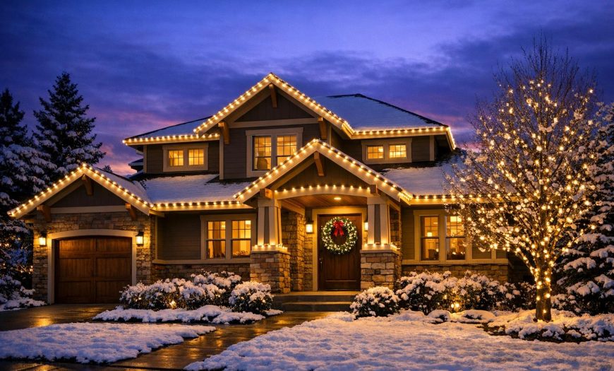
Placement: roofline + entry + subtle pathway markers (no shrub overload).
Best for: craftsman, bungalow, and modern homes that look better with clean lines than heavy coverage.
2) Mile High Modern (Cool White + Geometry)
Palette: cool white (icy) with crisp, uniform spacing.
Placement: straight roofline runs, window outlines, and architectural angles; minimal yard décor.
Best for: contemporary builds, townhomes, and commercial façades with strong edges.
3) “Snow-Glow” Tree Canopy
Palette: warm white or cool white (choose one) + optional soft twinkle on canopy only.
Placement: wrap trunks and primary limbs tightly; add canopy sparkle up high for depth.
Best for: properties with mature front-yard trees—especially businesses that want a high-impact look without covering the building.
4) Classic Colorado (Warm White + Red “Front Door Moment”)
Palette: warm white throughout + a single red focal point at entry (bow, wreath, or limited red lighting feature).
Placement: roofline + entry columns/rail + a short “welcome” path.
Best for: homeowners who want traditional charm without going fully multi-color.
5) Color-Changing “Seasonal Switch” (App-Controlled Themes)
Palette: programmable colors for holidays, sports, and events—set to warm white most nights, then schedule special scenes.
Placement: roofline + peaks + one yard focal feature (tree or porch).
Best for: families and businesses that host events, want variety, or prefer a “one system, many looks” approach.
6) Warm White + Candlelight Windows
Palette: warm white exterior + warm window glow (consistent tone).
Placement: roofline plus window outlines or coordinated interior window lighting to add depth.
Best for: older homes, brick façades, and boutique storefronts where “cozy” is the brand.
7) “High Contrast” Commercial Pop (White + One Brand Color)
Palette: clean white as the base + one accent color to match brand identity (used sparingly).
Placement: parapets, entries, and trees; keep signage readable and uncluttered.
Best for: retail, offices, restaurants—anywhere you want curb appeal without visual noise.
Theme-to-property matching tip
If your property has strong architectural lines (modern, commercial), choose a geometry-forward theme (Mile High Modern, High Contrast Commercial Pop). If you have natural landscaping (large trees, layered shrubs), pick a canopy or lodge theme so the yard becomes the showpiece.

Quick “Did you know?” facts that improve your design (and your season)

Did you know #1: “White” isn’t one color.
Warm white and cool white differ by color temperature (Kelvins). Keeping a consistent white temperature across rooflines, trees, and garland is one of the fastest ways to make a display look intentional—not pieced together.
Did you know #2: LEDs run cooler and use less energy than incandescent.
LED technology is widely recommended for holiday strings because it’s more energy-efficient and cooler to the touch than traditional incandescent options—helpful for both operating costs and safety planning.
Did you know #3: Timers help your display look better.
A consistent schedule keeps lighting crisp for evening traffic hours while avoiding “all-night glare.” It also reduces wear on components and can lower your seasonal power use.

Theme-building checklist (what pros decide before installation day)

Design Decision What to Choose Why It Matters in Denver
White tone (Kelvin) Warm white or cool white (commit to one) Cold nights and snow reflections can exaggerate mismatched whites—consistency reads “custom.”
Bulb style Mini, C7/C9 look, or faceted Large bulbs can read brighter from the street; minis can look more refined on tight rooflines and railings.
Focal point Entry, peak, tree, or signage A strong focal point prevents the “random coverage” look and helps your property stand out without overdoing it.
Animation (twinkle/chase) Static base + selective sparkle Selective twinkle adds depth. Too much motion can overwhelm neighbors and distract from architecture.
Power + control Outdoor-rated circuits, timers, and zoning Zoning makes troubleshooting easier after snow/wind events and keeps the display consistent throughout the season.
Maintenance-friendly design tip
Create “service zones” (roofline zone, entry zone, tree zone). If a section needs attention mid-season, you can address it without disturbing the rest of the display.

Local Denver angle: designing for snow, wind, and rooflines

Denver weather can shift quickly—sunny one day, snow and wind the next. That matters for both aesthetics and staying power. A display that looks great on install day should still look aligned after freeze/thaw cycles, gusts, and occasional heavy snow loads.

Design for visibility on early sunsets
Aim your “wow factor” at the first thing people see from the street: peaks, roofline, and a dominant tree. If you only decorate low shrubs, snow cover can mute your impact.
Choose clean lines for windy corners
On exposed edges and higher rooflines, tight, consistent runs with secure attachment points help prevent sagging and shifting. That keeps your roofline looking crisp even after a rough week of weather.
Plan for safe takedown and storage
A “one-and-done” theme is great, but a reusable plan is even better. When your lighting is designed and labeled for repeat seasons, you’ll get more consistency year to year—and less hassle when it’s time for removal and storage.

Ready for a custom theme (designed, installed, maintained, removed, and stored)?

Denver Christmas Light Installers creates cohesive holiday lighting themes for homes and businesses across the Denver metro area—built for curb appeal, safety, and a smooth season from start to finish.

FAQ: Holiday lighting themes and custom designs in Denver

What holiday lighting theme looks best for resale-friendly curb appeal?
Warm-white roofline lighting with a clean entry focal point is a safe, high-end look that works on most Denver homes. It reads classic, photographs well, and avoids the “busy” feel that can clash with architecture.
Should I choose warm white or cool white for Denver winter?
Either can look great—what matters is consistency. Warm white tends to feel cozy and traditional; cool white feels icy and modern. If your home is brick or earth-toned, warm white often complements it. If your property is modern with sharp lines, cool white can look intentional and crisp.
How do I keep a display from looking “random”?
Pick one anchor (roofline, entry, or tree canopy), choose one white tone (or a controlled color palette), and repeat the same bulb style across the property. Then add one focal feature—like a single dominant tree wrap or a strong peak highlight.
Is color-changing lighting worth it?
If you want multiple looks (holiday scenes, special events, or branding moments) without buying new lights, color-changing systems can be a smart choice. Many people keep a warm-white “default” and schedule color scenes for weekends or events.
When should Denver homeowners and businesses schedule installation?
Earlier scheduling gives you the best selection of dates and more time for design planning—especially if you want tree wraps, custom roofline work, or multiple zones. If you’re aiming for lights on around late November, it’s wise to plan well ahead.
Where can I see more examples or get quick answers?
Browse our Gallery for inspiration, or visit our FAQs for common service questions.

Glossary: simple definitions for lighting design terms

Color Temperature (Kelvin / K)
A measurement that describes how “warm” (more golden) or “cool” (more icy/blue) a white light appears. Consistent Kelvin across your display helps it look uniform.
Roofline
Lighting installed along the edges of the roof, peaks, and eaves. It’s often the “anchor” that makes a home or building pop from the street.
Zoning
Separating a display into controllable sections (for example: roofline zone, entry zone, tree zone). Zoning helps with scheduling, troubleshooting, and mid-season maintenance.
Canopy Lighting
Lights placed through the upper branches of a tree to create an overhead “sparkle” effect. When done selectively, it adds depth without overwhelming the yard.

Leave feedback about this

  • Quality
  • Price
  • Service
Choose Image
0 Item $0.00
Loadding...