
A cohesive color plan makes your lights look intentional, upscale, and brighter from the street
Color coordination is the difference between “we put up lights” and “our home (or storefront) looks professionally designed.” In Denver, where winter skies can turn bright displays into a soft glow and snow can reflect light back onto your property, a smart palette helps your holiday lighting read clearly from the curb—without feeling busy. Below are practical, design-forward ways to choose colors, keep them consistent, and build a display that photographs well and looks even better in person.
The biggest “color mistake” we see
Mixing different whites (warm white + cool white) in the same sightline. Even when the bulbs are all “white,” the color temperature can clash and make the display look mismatched. Pick one white temperature and commit to it across rooflines, windows, and accents.
Start with one decision: What “white” is your foundation?
Your base white is the canvas for everything else. For many Denver homes, warm white creates an inviting, classic look (often associated with “soft white” ranges around the 2700–3000K neighborhood). Cool white reads crisper and more modern, but can lean icy—especially against snow and stone. A “pure/neutral white” range can exist between them, but it’s harder to match across different product lines, so consistency matters most.
Quick rule
Choose one white temperature for the “architecture” (roofline, peaks, windows, columns). Then add color as the accent—not the other way around.
Build a palette that fits your architecture (not just your favorite colors)
Denver has everything from historic brick bungalows to modern builds with black trim and metal accents. The best-looking holiday lighting design treats the home or building like a backdrop and uses color to highlight lines and focal points.
3 proven palette styles (easy to execute)
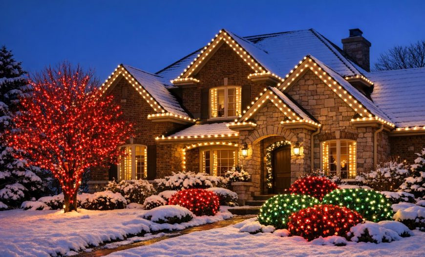
1) Classic: Warm white + red + green (use color on shrubs/garland; keep roofline white).
2) Elevated “designer” look: Warm white + one accent color (deep red, champagne gold, or cool blue used sparingly).
3) Modern: Cool white + one bold accent (blue, icy teal, or a controlled RGB pattern on a tree—while the house stays consistent).
Step-by-step: Color coordination that looks professional (without overthinking it)
Step 1: Pick a “dominant” color and a “supporting” color
Dominant = what you see first (usually your white base on the roofline). Supporting = what adds personality (trees, wreaths, garland, or a single focal tree). If you add a third color, keep it subtle and limited to one feature.
Step 2: Use “zones” so colors don’t compete
Think in zones: roofline, entry, landscape, trees. Put your cleanest, most uniform lighting on the roofline and windows. Reserve color for landscape and the entry moment (wreath/garland/columns). This keeps the display readable from 20–30 feet away.
Step 3: Repeat the accent color at least 3 times
Repetition is what makes a color plan feel “designed.” Example: if your accent is red, repeat it on the wreath, a pair of shrubs, and a tree trunk wrap. If you only use an accent once, it looks accidental.
Step 4: Control brightness so your colors stay true
Color coordination can fall apart when one area is dramatically brighter than another. Keep “architectural” lines consistent and avoid mixing bulb types that have different diffusion or intensity. If you’re using color-changing features, set brightness to match nearby static lights so the palette stays cohesive.
Step 5: Test your palette from the street (and from inside)
Walk to the curb and look for “hot spots” (too bright) and “gaps” (too dark). Then check from inside your main windows. A great exterior display shouldn’t make your living room feel like a stadium—especially important for residential comfort during long winter nights.
“Denver Christmas colors”: palettes that look great with snow, stone, and evergreens
Denver’s winter environment can amplify certain hues. Snow reflects light, evergreens add deep green contrast, and many homes feature warm-toned brick or tan stone. These pairings tend to look polished across neighborhoods from Wash Park to Highlands and out through the metro.
Palette ideas (simple + high impact)
Warm white + deep red: Cozy, classic, and photographs beautifully.
Warm white + champagne gold: “Luxury lodge” feel, especially on stone façades.
Cool white + icy blue: Crisp and modern; best when kept minimal and symmetrical.
Warm white + green (evergreen emphasis): Subtle, natural, and great for landscapes and trees.
Quick “Did you know?” facts that help you design smarter
Consistency beats complexity
Two colors used consistently usually look more premium than five colors used randomly.
Whites don’t “blend” well
Warm white and cool white can look like two separate installations when placed side-by-side—especially along rooflines and window trims.
Color-changing works best as a feature, not the whole house
A single focal tree, a canopy, or a controlled façade outline looks intentional; “everything flashing” often reads chaotic from the street.
At-a-glance table: Which palette should you choose?
| Goal | Best Foundation | Accent Colors | Where It Shines |
|---|---|---|---|
| Classic & cozy | Warm white | Red, green | Brick homes, traditional neighborhoods, family-focused displays |
| Upscale & warm | Warm white | Champagne/gold | Stone façades, evergreen landscaping, commercial entries |
| Modern & crisp | Cool white | Blue/teal (minimal) | Modern architecture, clean lines, bold symmetry |
| Playful, event-ready | Single white or dimmed RGBW | Controlled color-changing scenes | One focal tree, canopy moments, storefront promotions |
Local Denver angle: Practical color choices for real winter conditions
Denver weather can shift quickly—sunny afternoons, cold nights, and occasional snow/ice. A few local-friendly design choices help your colors stay consistent:
Use white to define edges: Rooflines and window trims stay readable even when snow brightens the scene.
Put color where it won’t “wash out”: Shrubs, columns, and tree trunks hold color well and create depth.
Choose one statement feature: A wrapped tree, a lit entry, or a clean roofline is often more impactful than trying to light every surface.
Plan for visibility from both directions: Many Denver streets are parking-heavy in winter, so sightlines can change—make sure your focal point is tall enough (roofline/entry/tree canopy).
Want inspiration?
Browse real-world display styles and see how different palettes look on different property types.
Budgeting your palette?
Packaging often affects how much “coverage” you can do in one consistent color temperature.
Trees are your best color canvas
A wrapped trunk and limbs can add depth and “wow” without changing your whole home palette.
CTA: Get a cohesive color plan (and a display that installs safely)
If you want your holiday display to look intentional from every angle—roofline, entry, landscape, and trees—Denver Christmas Light Installers can help you choose a palette that fits your property and execute it cleanly with professional installation, maintenance, takedown, and storage.
FAQ: Color coordination for holiday lighting in Denver
Should I choose warm white or cool white for my house?
Warm white is the most common choice for a classic, welcoming look and tends to complement brick and stone nicely. Cool white can look sharp on modern homes with strong lines and darker trim. The key is consistency—don’t mix whites in the same view.
How many colors should I use on the exterior?
Two is the sweet spot for most homes: a foundation white plus one accent. If you want three, keep the third color limited to one feature (like a tree or the entry) to avoid visual clutter.
Where should color go if I want a clean, high-end look?
Keep architectural lines (roofline, windows, columns) in one consistent white. Add color to landscaping elements: shrubs, garland, wreaths, and one focal tree. This creates depth while keeping the home’s outline crisp.
Do color-changing (RGB/RGBW) lights work for holiday displays?
Yes—when used intentionally. They’re best as a “feature zone” (a tree, a canopy, or a single façade outline) with controlled scenes, rather than changing everywhere at once. Matching brightness to your static lights keeps the display cohesive.
Can you help me choose a palette that fits my home and neighborhood?
Yes. A design consultation typically considers roof height and lines, entry focal points, landscaping, existing exterior lighting, and the viewing angle from the street. If you’re ready to plan, you can reach out directly.
Looking for more quick answers? Visit our FAQ’s page.
Glossary (helpful lighting terms)
Color temperature (Kelvin / K)
A scale describing how warm (yellow/amber) or cool (blue/icy) a white light appears. Different “whites” can clash if mixed.
Warm white vs cool white
Warm white feels softer and more traditional; cool white feels brighter and icier. Pick one for the foundation of your display.
RGB / RGBW
Color-changing systems. RGB mixes red/green/blue to create colors; RGBW adds a dedicated white channel that can produce a cleaner white for everyday or “classic” scenes.
Zones
Groupings of areas (roofline, entry, landscape, trees) designed with a specific purpose so colors don’t fight each other.

Leave feedback about this